2014/05/30(金)Perl Data Language 統計編 #06 「時系列データの折れ線グラフ」
データ↓
http://www.tokyo-tosho.co.jp/download/DL02122.zip
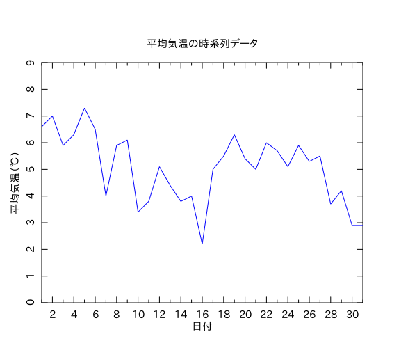
問1.1の7)は平均気温の変化を時系列データとして折れ線グラフで描けという問題。これは瞬殺できる問題ですな。
#!/usr/bin/env perl

use strict;
use warnings;
use PDL::Lite;
use PDL::IO::Misc ();
use PDL::Graphics::PLplot;
use DDP filters => { -external => [ 'PDL' ] };

my $infile        = 'weather.csv';
my $colnum_hizuke = 0;
my $colnum_kion   = 1;

my ($hizuke, $heikin_kion) = PDL->rcols($infile, { COLSEP => ',', INCLUDE => qr/[0-9]/ }, $colnum_hizuke, $colnum_kion);

my $pl = PDL::Graphics::PLplot->new(
    DEV   => 'xcairo',
    TITLE => '平均気温の時系列データ',
    XLAB  => '日付',
    XTICK => 2,
    NXSUB => 2,
    YLAB  => '平均気温(℃)',
    YTICK => 1,
    NYSUB => 1,
    COLOR => 'BLUE',
);

$pl->xyplot($hizuke, $heikin_kion, BOX => [ $hizuke->minmax, 0, int($heikin_kion->max) + 2 ]);
$pl->close;